Carrefour
Retailer App & Website
Carrefour’s aisles are packed, but their mobile app? Not so much.
Offline shoppers mostly used the app for one thing: scanning their Bonus card and activating coupons, not much more.
My Role
Lead Product Designer
UX Designer
Researcher
Team
Worked cross-functionally with Product Owners, Analysts, Uxers, A/B testing unit, DPO.
Objectives and goals
• Convert offline shoppers into active digital customers = The case we will discuss
• Increase Marketing cookies conversions.
• Supervise the design team and set-up an agile methodology.
• Revamp the V.I.P club (Special club for premium users).
Context & Challenge
Mission
Upgrade digital engagement for offline shoppers, to help them understand the generosity of Carrefour.
Structural Challenges
• The app was buggy and built on a very old tech stack.
• Zero in-house developers
• Messy communication stack for requests ( Whatsapp, google chat, meetings, emails, … )
• No agile processes in the UX team
Research & Insights
Discovery
• Direct user testing in stores made one thing painfully clear: language matters. For years, the coupon feature, where the generosity shined, was buried under a vague tab named “wallet.”
• In tests, over 90% of users scratched their heads at the word “wallet.” They scanned, they left, missing deals right under their noses.
• When we switched the tab label to “coupons,” it was like flipping on a light : Users immediately understood and navigated to it.
Problem Statement
How might we turn app confusion (“Wallet? Huh?”) into instant, value-packed interactions for even the least tech-savvy shopper?
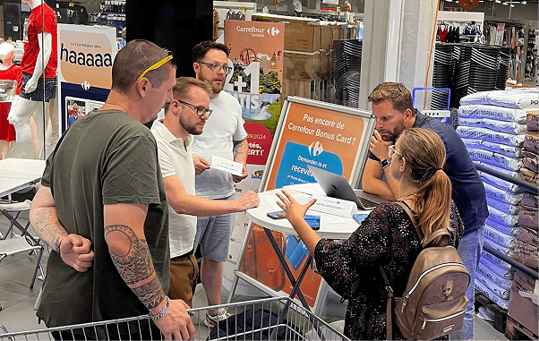
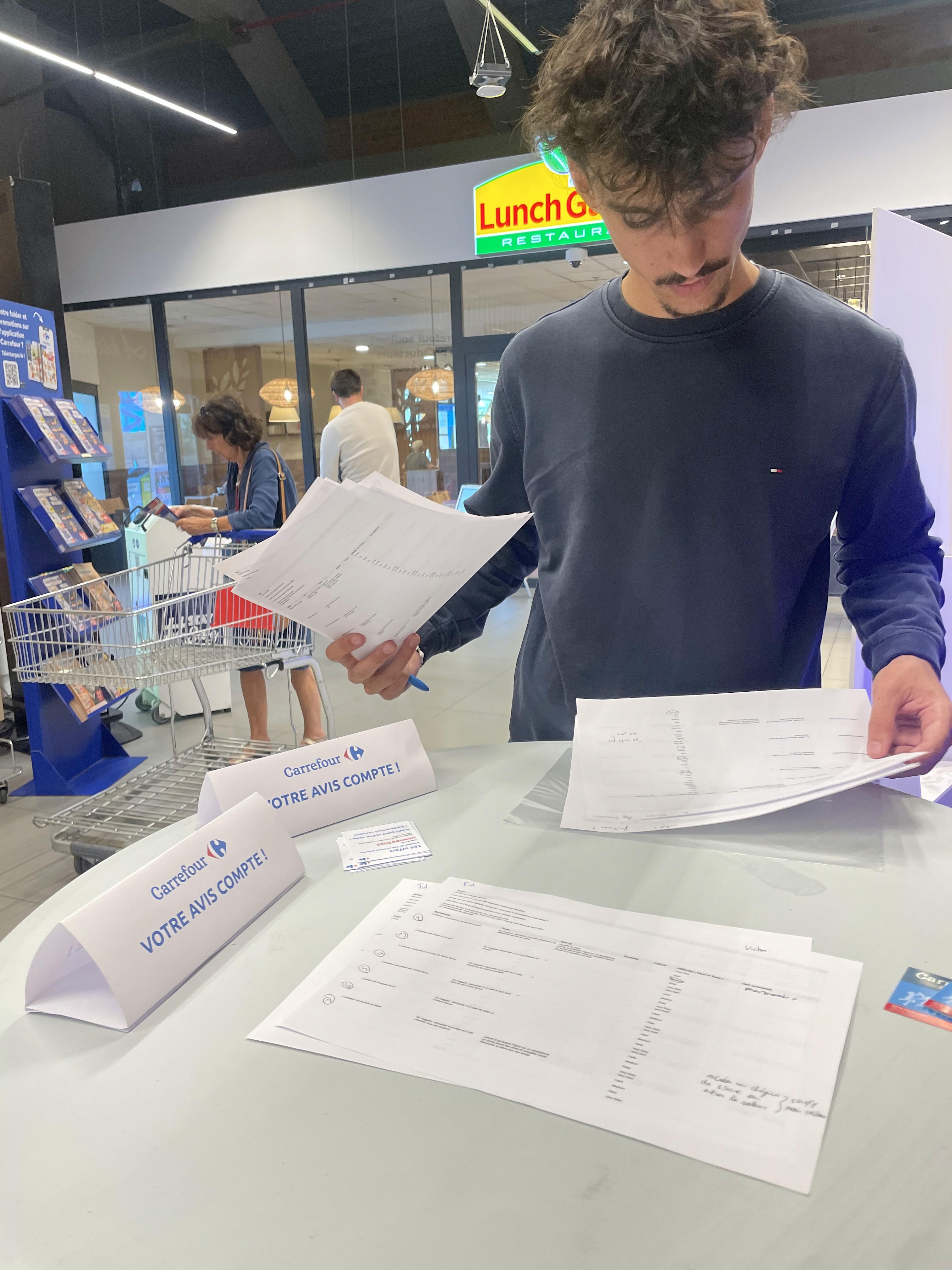
Photo from the UX team and the PO interviewing customers
Strategy & Approach
Microcopy Audit: Pinpointed jargon and ambiguous labels throughout the app; prioritized fixes.
Iterative Testing: Asked 20 real users into the store, put devices in their hands, and watched where they got lost.
Quick Win Implementation: Changed "wallet" to “coupons” => instant clarity.
Communication Shift: Updated supporting content (FAQs, help modals, banners) to reflect relatable, benefit-driven language.

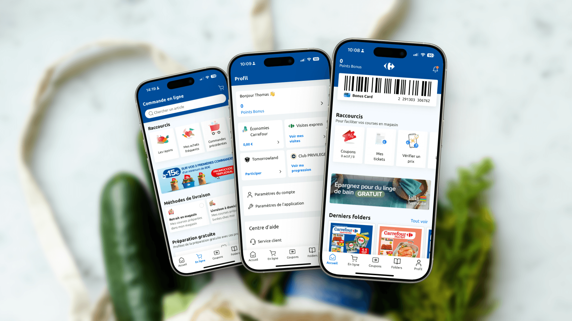
Let slash the wallet and welcome "coupons"
Design & Prototyping
Simplified navigation: made "coupons" appears in the tab bar
Rapid Figma prototypes with A/B labeling: observed time-to-first-coupon activation drop by 50% post-change (“coupon” vs. “wallet”).
Used test-and-learn cycles: no designer ivory tower thinking, real users, real feedback.

👈 Before VS After 👉
Wallet ➡️ Coupons

Impact
Label change alone = 90% improvement in user comprehension.
Coupons redemptions up post-update (stats in progress).
Users reported less friction, and more value felt per app visit.
Reflection & Learnings
The most difficult challenge for this project was to understand the pain points about coupons. The "wallet" word was untouchable, it was used by cashiers and clients for years and nobody wanted to touch it. That's what happens when you hire me, I break things to fix them and make them more powerful.

Stéphane Janssen
Sr Business Analyst - Carrefour
Thomas consistently aligned his work with our group design standards, ensuring a seamless and cohesive user experience while introducing fresh and innovative ideas. His positive mindset and remarkable sense of compromise made collaboration effortless. We look forward to the opportunity to collaborate again in the future.