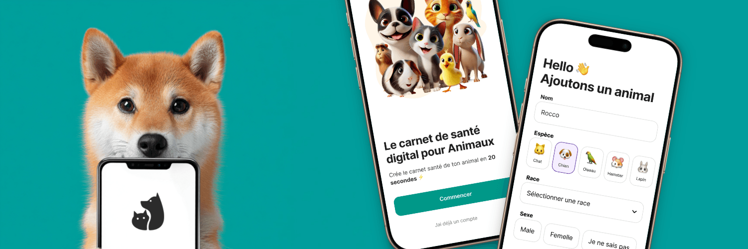
Medika
Digital Health Record for pets
Does your pet deserve better record-keeping than your tax receipts? Me too.
That’s why I rebuilt Medika, after the original app’s leaky funnel left most users lost.
My Role
Product Designer
Analytics & Funnel Detective
Conversion Copywriter
Team
Worked closely with Product Owner
Collaborated with the iOS/Android flutter dev
Objectives and goals
• Double user activation by slashing onboarding drop-off
• Improve conversion from “Signed up” to “First pet profile created”
• Validate onboarding redesign hypothesis with quantitative funnel/customer data
• Set the stage for more in-app purchases
Context & Challenge
Mission
Transform pet-care chaos into a zen garden of digital records
Structural Challenges
• Clunky, multi-step onboarding, old flow made users jump through more hoops than an agility course
• Ambiguous value proposition at sign-up: “What am I signing up for again?”
• Analytics was only used to monitor acquisition before my intervention. No clarity = no progress
• Nobody had growth skills in the team
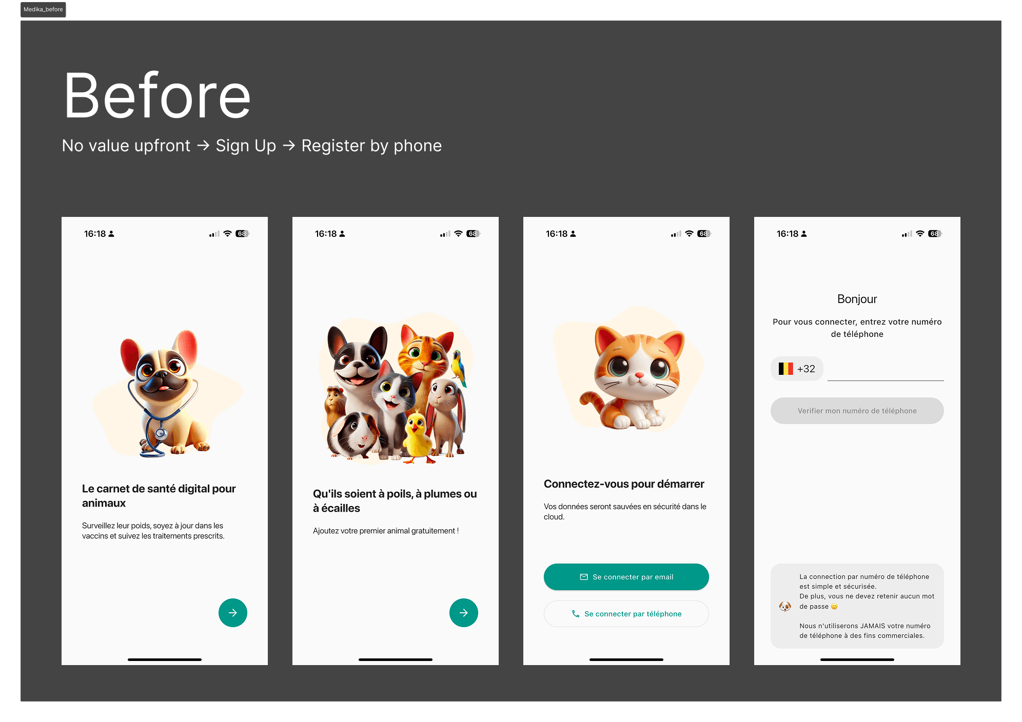
The good ol' "zero interraction" onboarding flow
Research & Insights
Discovery
• Ran funnel deep-dives in Google Analytics
• Quant interviews with frustrated new users (aka, “why did you ghost us after step 2?”)
• Examined support tickets: recurring theme, onboarding confusion
Key Insights
• Massive drop-off in onboarding: Only 42,5% got past “Create Account”; drop-off doubled at “Create a Pet.”
• Email verification was a hidden fiend: every extra step = more abandoned flows
• Users didn't understand the value of the app upfront.
Validation
• Tested low-fidelity onboarding redesigns in user tests before full build—users literally said “Oh, that makes sense now!” (direct quote, could frame it)
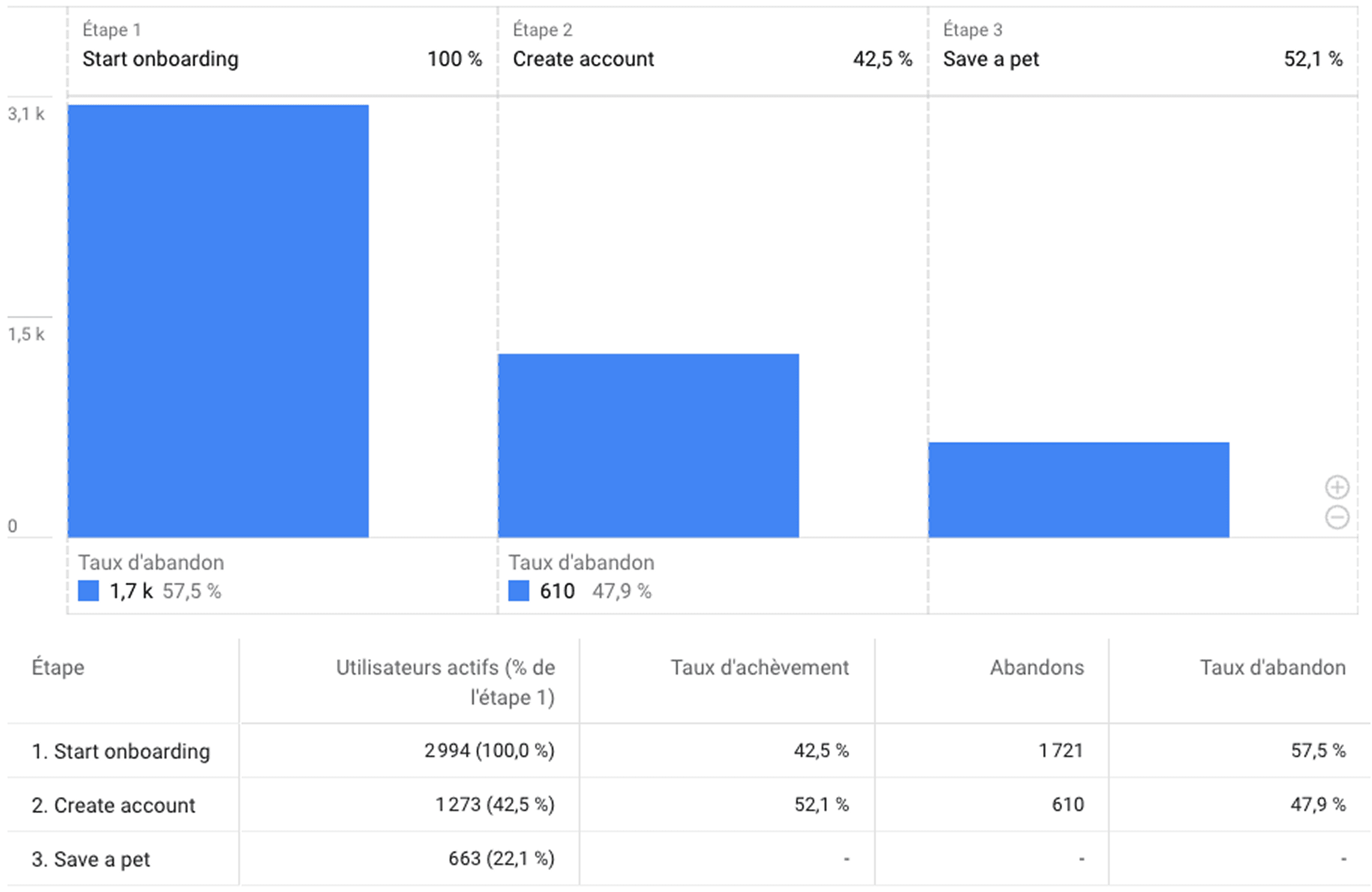
Onboarding funnel
Problem Statement
How might we convince “pet parents” that Medika is worth adopting all before they lose interest at the account creation ?
Strategy & Approach
Ruthlessly cut onboarding fields: essentials only (name, type, breed, sex)
2 steps onboarding + Social login (Google): Reducing friction was essential
Quick Win Implementation: Changed "wallet" to “coupons” => instant clarity.
Funnel for each case: Segmented different funnels in Googke analytics to track where users bounced
Design & Prototyping
Tools: Figma (yes, I’m one of those... but I prototype fast)
Iterated onboarding: From 4 screens → 2.5 streamlined steps, story-like progression
Ran a/b with real users: New onboarding doubled activation rate (from “wow, 28% finishing this” to “wait, people are using this!”)
Before: Pet profile felt “mandatory-awkward.”
After: Frictionless opt-in + a peek at the good stuff first
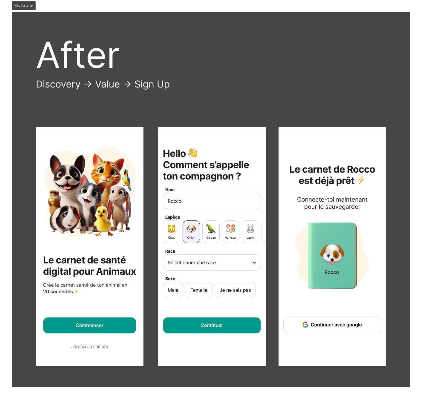
Redesigned onboarding, way less friction
Impact
Activation rate: Up 2x (Yep. Doubled. That’s not a typo.)
Account creation from 36% to 72% of users
Pet profiles created per new user: +15% (users weren’t just visiting, they were settling in)
In-app purchase at first usage from 0,6% to 1,7% 💸
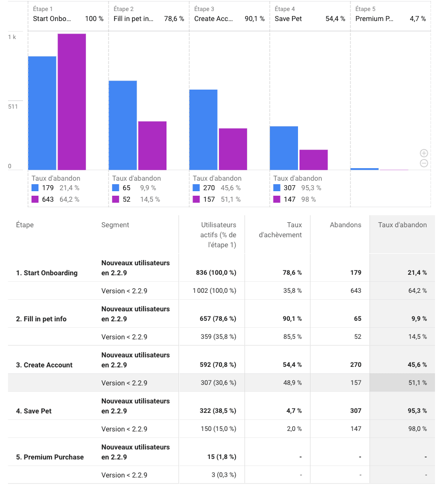
Onboarding funnel before and after UX revamp
Reflection & Learnings
One honest challenge? Funnel blindness is dangerous. If you can’t measure, you’re guessing (and you’ll lose more users than a dog park loses tennis balls).
Lesson for next time: Dashboard everything, then design.
And why does it matter? Because, in pet tech, friction at onboarding means not just lost revenue, but pets without proper care. Every smoother path means a healthier, happier animal (and saner owner). Also: never underestimate the power of a well-worded, step-skipping “welcome” screen.

Valentin Taleb
Founder - Medika
Thomas is, by far, the best UI/UX designers I have ever worked with. I have worked with him on multiple projects (web & mobile) for more than 10 years and he continues to impress me with clear, pure, and amazingly good-looking designs.